

Duration
Ongoing
My role
Product design
Team
Quentin Morisseau
Ian Lambert
Emilie de Boise
Matthieu Babe
Vincent Poulet
Canopy is Luko's design system, built to power all our products and used across both internal and client-facing touchpoints.
Context
As Luko scaled, we faced increasing challenges in maintaining consistency across all products. To address this, the product design team in collaboration with the brand team and the engineering team, initiated a more conscious and in-depth thinking of the design system.
The goal of this project wasn’t to create a new design system from scratch—talented Luko designers had already built it. My role was to help refine, organize and structure it further, establishing a more granular and thoughtful source of truth for designers and developers. Using Figma as our primary tool, we enhanced functional consistency across all our products.
Problematics
Luko was rapidly expanding its feature set, so maintaining consistency across all plateforms became increasingly challenging. The fast-paced development cycle made it difficult to ensure uniform design standards, leading to inefficiencies.
As Figma evolved with new features, our design system became outdated and wasn’t leveraging its full potential. We needed to modernize it to improve efficiency and maintainability.
Solution
Our focus was on refining Canopy into a more consistent foundation across web, mobile, and helper libraries. Not only to streamline workflows, ensure consistency across all plateforms and improve cross-team collaboration but also to simplify onboarding for new team members, enabling them to integrate seamlessly into the design and development process.
We held regular designer workshops and design-dev syncs to iterate on and refine what had already been built.
Let’s take a look at some of the key components that make up Canopy.

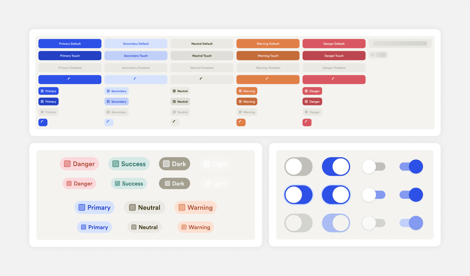
Foundations
A foundational set of colors, typography, sizing, border-radius, and shadows ensuring consistency across all platforms.
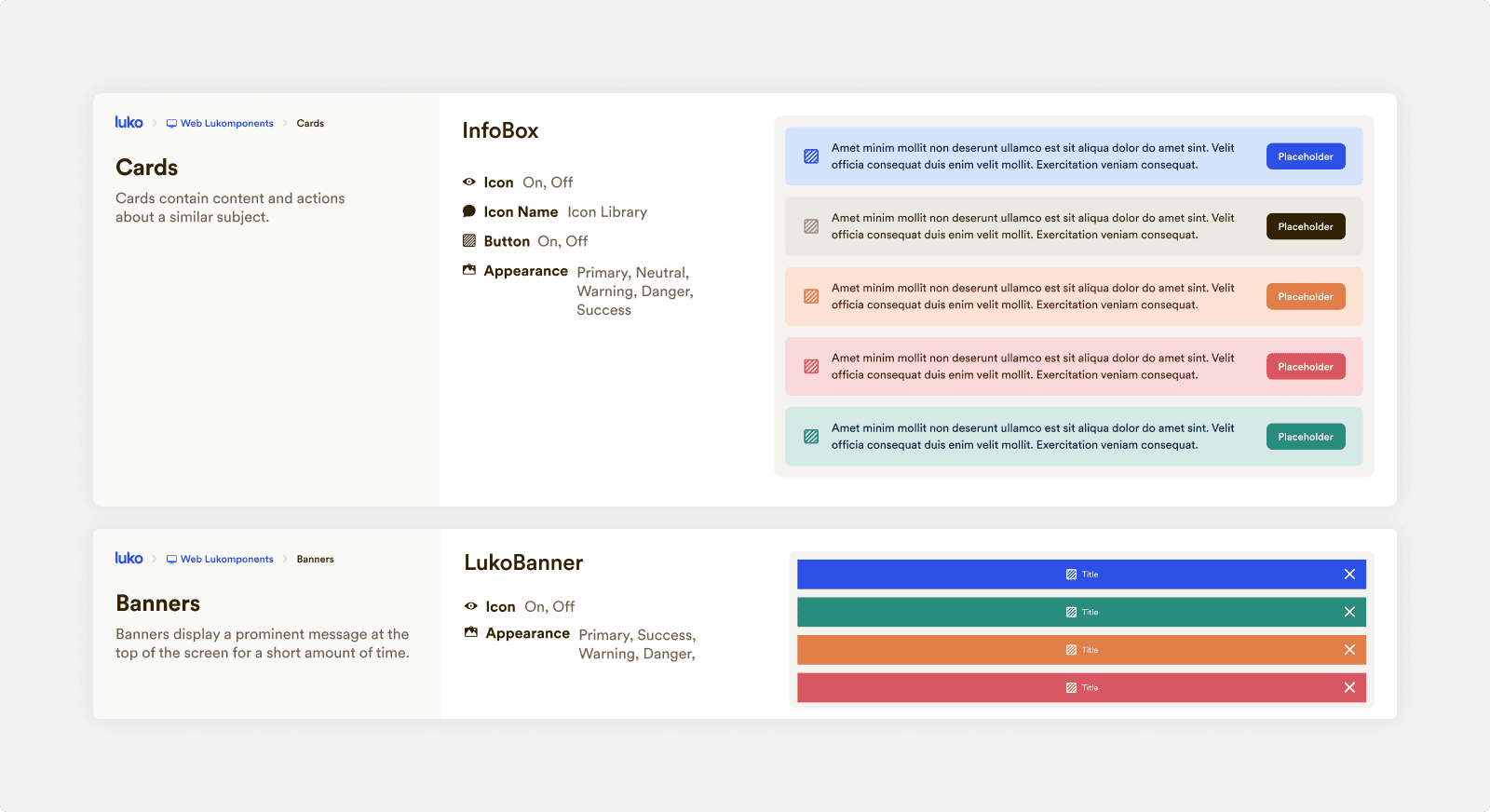
Web library
Set of reusable UI components and design patterns, ensuring consistency across web projects. Streamlining design and development by offering standardized guidelines for responsive, accessible, and cohesive user interfaces.
Mobile library
The mobile library provides a structured set of UI components and design patterns for the Luko app, organized into iOS-specific, Android-specific, and cross-platform elements.

Icon library
A set of 350+ custom icons in 12px and 16px variants, designed specifically for Luko by previous designers.
Helper
Collection of reusable utilities, guidelines, and patterns that streamline design and development workflows.
©2025 Enzo Reda