

Duration
4 weeks
My role
UX/UI design
UR Research
Product strategy
Team
Ian Lambert
Tristan Boulfroy
Artemis is Luko’s claims management tool, used daily by our claim & fraud team to analyze, resolve, and track customer claims. It also serves as a communication hub, enabling them to notify leads, flag fraud, or collaborate with peers.
Context
Our internal claims tool features a mentions system used daily for payment validation, fraud checks, general questions, and claim updates.
Through weekly shadowing, we identified friction points that required our attention.
To better understand how this feature is used, we conducted an in-depth user research composed of eight 1:1 interviews. These sessions helped us map pain points and prioritize improvements.
Problematic
When starting their day Fraud Managers, Lead CMs, and CMs prioritize urgent mentions. However, the current feature doesn’t show why they were tagged, forcing them to click each mention, open it, and decide whether to address it immediately
or later.

Initial design
Challenges
This project was a lot of fun to work on, with no shortage of ideas—quite the opposite, in fact. That being said it also came with some challenges.
The main challenge was aligning our vision with the dev team's capabilities. Artemis wasn’t built with theses updates in mind, so we had to find creative ways to design around development constraints.
Solution
I collaborated with product managers, users and developers to redesign the mention feature to improve user efficiency and satisfaction.
We held workshops, design reviews, and weekly syncs to stay on the right track. Once the feature was delivered, the focus shifted to training the team on how to use
it effectively.
With the launch of the new and reworked mentions feature users can now...
Instantly understand why they were tagged without having to open each mention
Treat their mentions by level of urgency and type of request
Navigate through their mentions more easily
Archive their mentions without any risks

New mention anatomy
The mention component was redesigned to provide more context to users. It now includes a content preview, an icon linked to the claim type, and a precise timestamp. Helping users quickly assess whether a mention requires immediate attention.
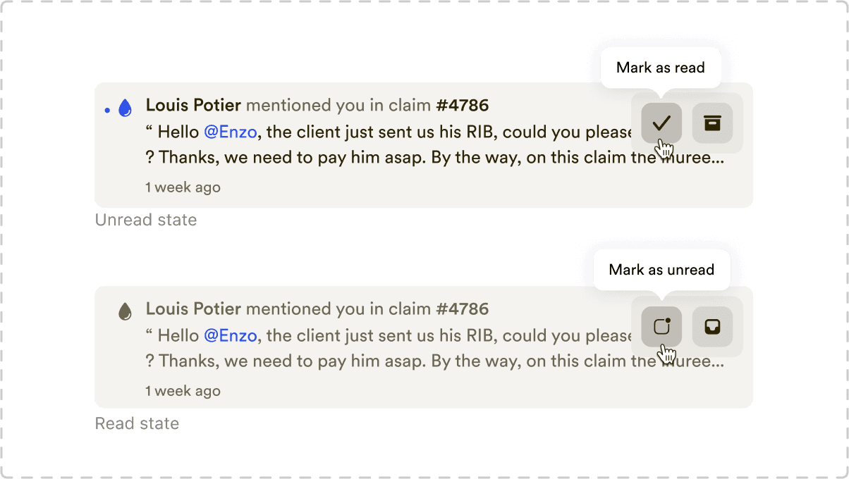
New mark as read system
We all know and love this feature—from social media chats to email inboxes, it adds an extra layer of control over workload. Users can now toggle between read and unread states whenever they want.

Improved archival system
Users now have an improved inbox and archive panel, improving clarity and reducing the risk of accidental archiving. They can also archive all read mentions at once for better efficiency.
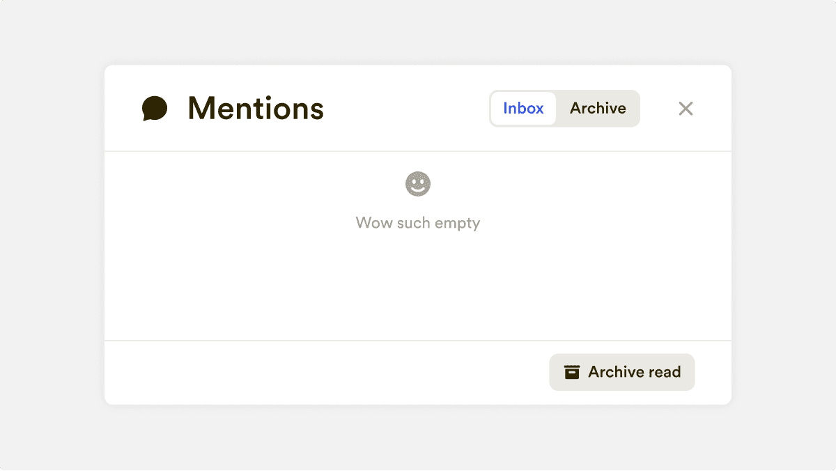
New empty state
I believe in adding light and fun elements to a product whenever possible. When designing internal tools for coworkers, it's essential not only to make their work easier but also to create a positive experience. After all, we’re designing for humans first. This simple empty-state message was well received by our CMs, I’m sure it brought a smile to their faces.
Results
Increased user satisfaction KPI from 5.5 to 6.7 out of 7
Reduced overall time spent on mentions by 28% with a faster focus on tag that require urgent attention
©2025 Enzo Reda